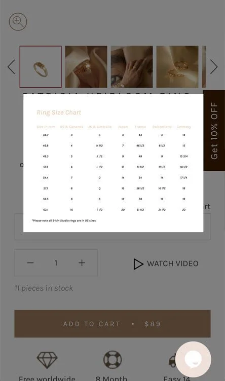
Helping users find their correct ring size.
the problem
82% of users were not adding rings to their cart. Heatmaps demonstrated very low engagement with the ring size chart on the product pages, which was not optimised for mobile viewing and offered no instruction on how users could measure their ring size. The ring size instructions were buried in the FAQs at the bottom of the product pages, where only 0.35% of users were reaching this point.
the solution
Competitor analysis uncovered that other jewellery brands offer assistance to help users easily find the right ring size without leaving the product page. The hypothesis for this test was that by optimising the current ring size pop-up, instead of sending users away for instructions, users would be more likely to purchase rings if it was easier for them to choose the right size.
the outcome
Improving the experience for users to find their ring size resulted in a decrease in bounce rate, and high engagement with the ring size pop-up.
+2.8% increase revenue
+2.54% increase conversion rate
+2.6% increase transactions

Improving the product page experience for users.
the problem
89% of users were not clicking Add to Cart. Heatmaps and session recordings revealed that users were basing their decisions above the fold, and were dropping off halfway down the page when the information became text-heavy.
the solution
By breaking up the copy using lists, icons and accordions to make specific information easier to scan and locate, the hypothesis was that users would be more likely to add to cart if they could quickly read the key details about the product.
the outcome
By improving the product page experience, users were able to scan the information quicker and find the relevant information easily.
+12% increase revenue
+5% increase transactions
+7% increase conversion rate
+7% increase AOV
-5% decrease bounce rate
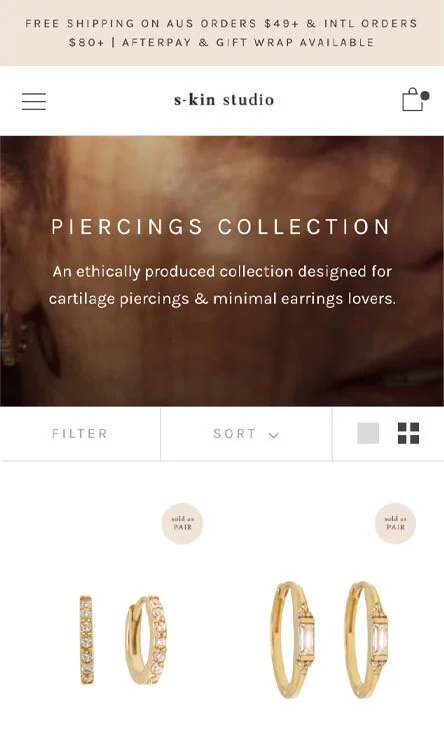
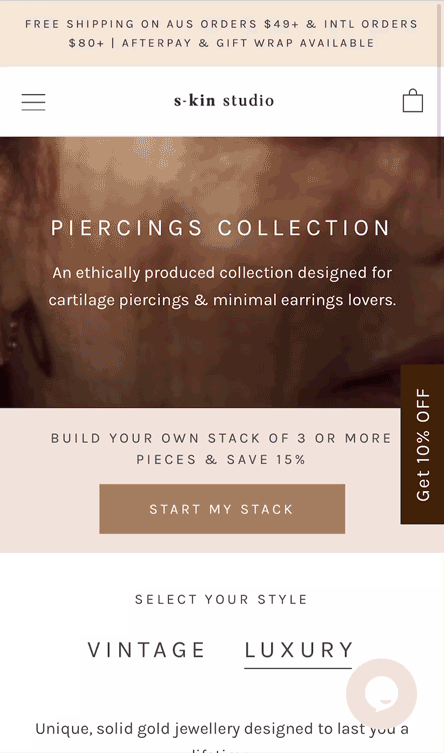
Educating users about the various piercing products and price points.
the problem
55% of users were not clicking through to a product from the collection pages. Heatmaps and users polls revealed that users were interested in filtering the collections to find the right product for them, but there was no education about the different material types, or what types of piercings the products were suitable for.
the solution
Implementing a visual filter on the piercings category page allowed users to filter products based on the type of the piercing they were searching for. The addition of the Vintage and Luxury tabs also educated users around the different materials used for the products, which in turn explained the differing price points.
the outcome
The inclusion of the visual filter and the Vintage/Luxury tabs on the piercings collections pages resulted in:
+6% increase revenue
+26% increase conversion rate
+28% increase transactions